The Making of the Narcolepsy Infographic
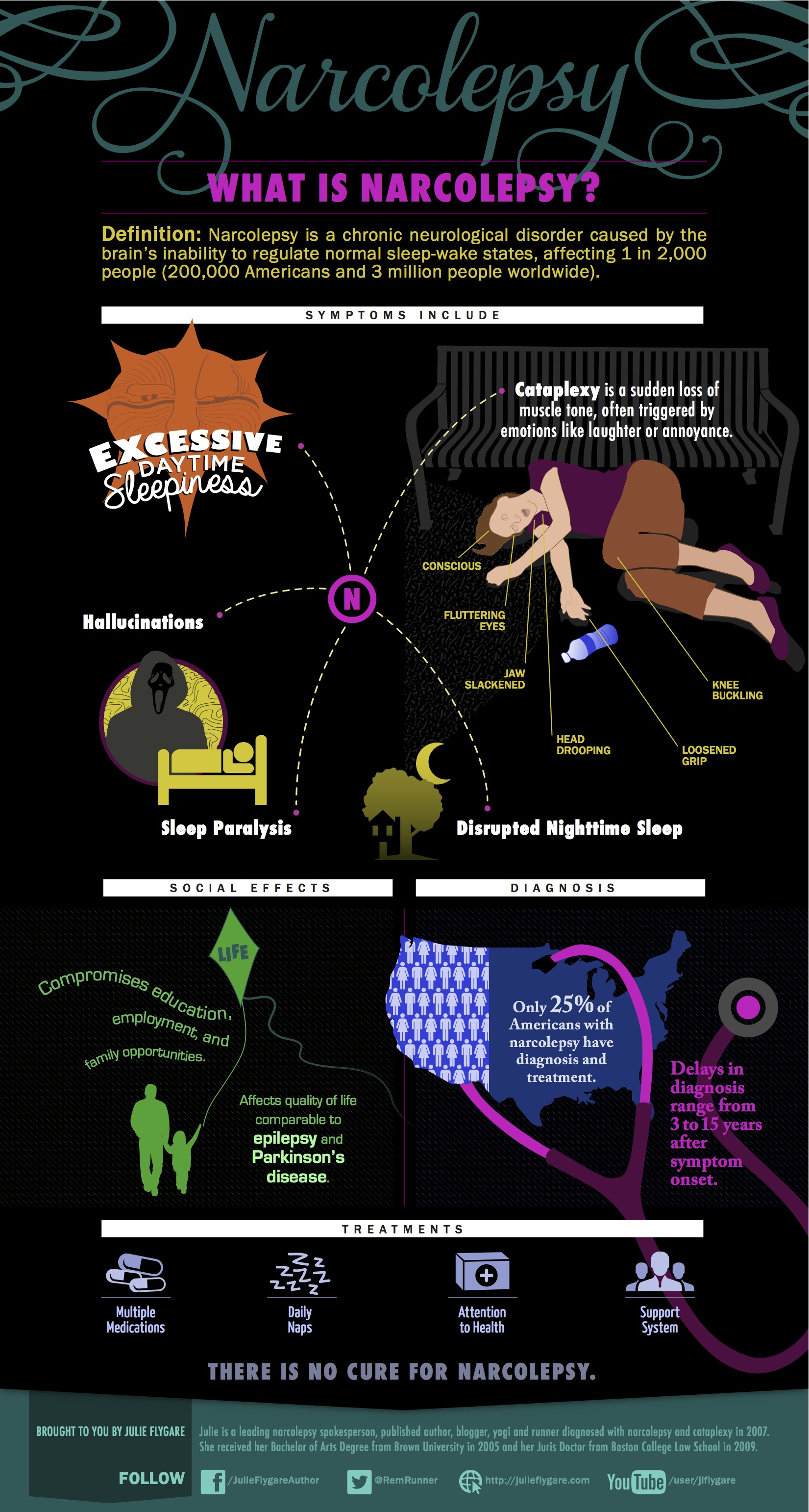
In just one week, over 20,000 people have viewed the narcolepsy infographic! Here’s how my dream became a reality.
 What about narcolepsy?
After viewing many cool health and disease infographics this past year, I couldn’t help but wonder, “What about narcolepsy?”
This made me sad. Narcolepsy deserved an infographic too, but how? I wasn’t a graphic designer and my personal funds and free time were limited. I loved the work of a local graphic designer, Anthony Nesossis so I contacted him in April. Anthony was excited about the project. Hurray!
 Brainstorming:
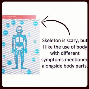
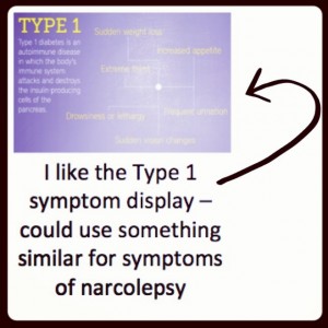
First, I researched other infographics to find what I liked and didn’t like. Next, I compiled narcolepsy facts. By the time I was done, I had 7 pages and hundreds of ideas.
How would I pick priorities? To be effective, only THE most essential facts could be included. It was painstaking process to narrow down my facts. By late May, I had 3 pages (still too much).
 Coming to life:
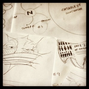
First, Anthony worked on overall design, themes, and colors. Then, we met for coffee to work on details in mid-June. This is where the infographic really came to life. I explained that excessive daytime sleepiness wasn’t always falling asleep in one’s soup, but more often fighting sleepiness. Anthony developed the adorable “Sleepy Sun”. For the diagnosis section – he had an ingenious idea of the U.S. map with a stethoscope around it.
Cataplexy Model:
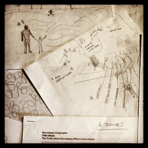
It was important to me that the infographic have a strong visual of cataplexy because I find cataplexy’s definition hard to grasp and different from seeing cataplexy. Plus, cataplexy can be isolated muscle weakness or full body attack. Anthony and I developed the idea of displaying the full body attack and listing the various smaller muscle loss areas.
“How should I draw cataplexy?” Anthony asked. I tried explaining, but eventually laid down in the coffee shop mimicking a full body attack. Anthony took photos – which he used to create the amazing cataplexy likeness. I’m a cataplexy supermodel! 😉
 Making the Magic:
After our meeting, Anthony had his work cut out for him. He generously devoted so much time and creative energy to this project. On the 4th of July, I opened my email to find the most beautiful and powerful narcolepsy infographic! It far exceeded my wildest dreams.
Since unveiling the infographic last week, over 20,000 people have viewed it and over 600 people have shared via social media – including the American Academy of Sleep Medicine (AASM) and NIH’s National Heart, Lung, and Blood Institute (NHLBI). In addition, one young woman will present on narcolepsy to her anatomy class this week using the infographic. I couldn’t be happier. Thank you all so much for sharing!
A big thank you to Anthony – for giving your heart and time to this project. Your work is magical!
[…] Thank you to my amazing graphic designer, Anthony Nesossis. Thank you to Alex Withrow for his pro video production! Read about the making of the infographic here. […]
How cool!! This infographic is amazing!
Thank you so much, Sara! Your support means so much to me. Hope you are feeling good these days!
This is really great. I love seeing the evolution of how artistic and creative things come to be. Thanks so much for taking the time to write this up!
Thank you, Alex! I really enjoyed writing this post.
That is fantastic, Julie! Colorful, informative, and great depiction and description of cataplexy, which is so hard to explain. It covers all the bases and makes narcolepsy understandable. Great job!
Thank you so much, Susan! I’m so glad you like the infographic. 🙂